Related Resources
You’ve probably heard the phrase, “Don’t judge a book by its cover.” And let’s be honest, it’s a great motto to live by when you’re making snap judgments about most things in life. But when it comes to reading comic books, and making them, judging a book by its cover makes all the sense in the world.
Sure, there have been some great comics with some not-so-great covers, and also a fair amount of comic books with great covers and lackluster storylines. Yet, when you take a look at some of the most iconic comic books in history, incredible stories frequently go hand-in-hand with amazing covers. It’s sort of a science, really.
When you’re creating a comic book, making an emotional connection with your reader and attracting them into reading and purchasing your comic is critical. Without this emotional connection, your comic book could very easily get lost in the shuffle.
So let’s take a look at the basic “science” of how to design your own comic book cover.
Step One: Study Other Comics
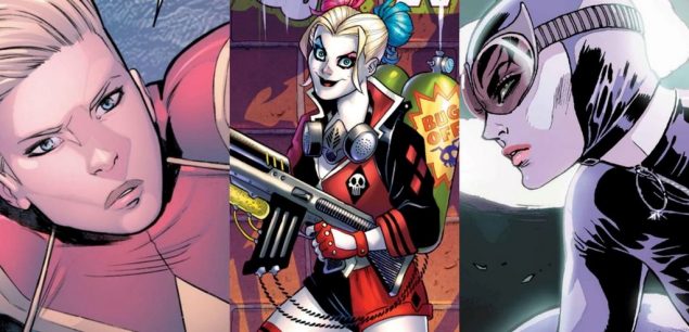
Even if you’ve read thousands of comic books during your lifetime, you may not have spent a lot of time looking at their covers in great detail. When you do, one thing you’ll notice right away is how much of the story is being played out on the cover itself.
Here are some important questions to ask yourself as you begin studying these comic book covers (and what you’ll ultimately be including in your own cover as well):
- What sort of tone is being communicated?
- Can you tell by the cover what genre the story is?
- Does the cover have the same elements and quality as the artwork inside?
- Is the cover attention-grabbing? Will it make a reader say, “I need to know what’s going on here.”?
Step Two: Plan Your Cover
Alright, so now that you’ve done some research on what makes a comic book cover interesting, it’s time to introduce these same features to your own comic’s cover.
First, let’s start with the title, which should work alongside your images to capture a comic book fan’s attention. You can play around with words here and get creative, just make certain you’re giving some sort of indication about the type of story they’ll be exploring in this particular issue. However, if you’re doing a one-off comic book instead of a series, you won’t have to worry about titling your comic book, as the name for your comic will work on its own.
Next, play off your comic book’s title by coming up with a few ideas on who you want featured on the cover and why. More often than not you’ll want to include your main character and/or the villain. However, there are times when you can make a convincingly eerie and thought-provoking cover by merely showing a shadow of a character or an important object from the book.
Lastly, decide how you’re going to highlight the story through these characters or objects in a way that entices readers to want to know more. This could include intense action, gloomy lighting or deeply emotional visuals. Really, the opportunities to get creative are endless, and the sky is the limit on your comic book cover.

Step Three: Lay Out Your Cover
You’ve chosen your title, picked out your heroes and villains, and even selected the type of mood your cover is going to display. Now it’s time to put these elements together by laying them out in a comic book sort of way. Here are some great options to choose from that have worked for thousands of comic books over the years (we did say it was a science, after all):
- Good versus evil: This is the type of comic that pits hero against foe in an upcoming battle in your comic book. It’s usually action-oriented and may even feature a bystander the hero is trying to protect.
- The class photo: If your comic book is filled with interesting characters, you can put many, if not all of them, on the cover of your book. While some people might say you should avoid cluttering up your cover with too many visuals, sometimes readers want more than a 1-vs.-1 type of comic.
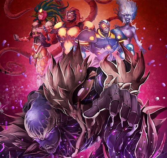
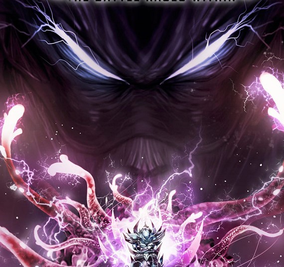
- Looming bad guy: A compelling idea for a cover is one where a villain’s face is magnified and placed over the superhero, who appears several times smaller than the comic book baddie. You can also try this with environments as well, like we did on a recent cover for Biowars: Awry.
- Give it a 3D spin: Use your drawing skills to give your cover a little perspective, meaning you can make a superhero appear to be coming out of the page or add a foreground and background image to give your cover some 3-dimensional depth.
- Be romantic: Have a love story going on in your comic book? If it’s important to the story (and it usually is), show the romance on your cover, especially if your audience is the type that will enjoy it. Be sure it’s tasteful though!
Step Four: Get Feedback
After you’ve laid everything out, one last important step for new comic book creators is getting feedback from other comic fans – and even comic book artists. If you get the majority to sign off on your idea, then it’s time to put it all together into a finished cover, making sure you have all the visuals, colors and title properly in place.
And remember, give your comic book cover your best effort in order to showcase the work that’s already contained within its pages. That way you’ll have your best chance of creating interest first and building a growing, enthusiastic fan base.


